if(!require(palmerpenguins)){install.packages("palmerpenguins");require(palmerpenguins);}
if(!require(dplyr)){install.packages("dplyr");require(dplyr);} # needed for glimpse
if(!require(ggplot2)){install.packages("ggplot2");require(ggplot2);}11 Intro to ggplot2
The info below is adapted from the book “R for Data Science, second edition” (r4ds2e). The book is available both online and in print. It was written by Hadley Wickham, who in large part is the driving force behind the tidyverse packages.
The online version of r4ds2e is here: https://r4ds.hadley.nz/
The intro to ggplot2 chapter appears here: https://r4ds.hadley.nz/data-visualize
In class we covered sections 1.1 through 1.3 of chapter 1, Data visualization from r4ds2e. In that context we discussed different “geometries” of a graph (e.g. dot plot, histogram, bar plot, box plot), aesthetics of a particular geometry (e.g. x position, y position, color, shape, size). We also discussed the concept of how variables in your data can be “mapped” to particular aesthetics.
11.1 Code from sections 1.1 thorugh 1.3 of r4ds2e
Below is a summary of the code that we went through.
Please see the following webpage for more info: https://r4ds.hadley.nz/data-visualize
# Here are the first few rows data.
# When viewing a tibble, you may not see all the columns if your screen is too narrow.

penguins
# A tibble: 344 × 8
species island bill_length_mm bill_depth_mm flipper_length_mm body_mass_g
<fct> <fct> <dbl> <dbl> <int> <int>
1 Adelie Torgersen 39.1 18.7 181 3750
2 Adelie Torgersen 39.5 17.4 186 3800
3 Adelie Torgersen 40.3 18 195 3250
4 Adelie Torgersen NA NA NA NA
5 Adelie Torgersen 36.7 19.3 193 3450
6 Adelie Torgersen 39.3 20.6 190 3650
7 Adelie Torgersen 38.9 17.8 181 3625
8 Adelie Torgersen 39.2 19.6 195 4675
9 Adelie Torgersen 34.1 18.1 193 3475
10 Adelie Torgersen 42 20.2 190 4250
# ℹ 334 more rows
# ℹ 2 more variables: sex <fct>, year <int># You can use the dplyr::glimpse function to
# view the names and datatypes of ALL the columns as well as
# view the first few values of each column.
glimpse(penguins)Rows: 344
Columns: 8
$ species <fct> Adelie, Adelie, Adelie, Adelie, Adelie, Adelie, Adel…
$ island <fct> Torgersen, Torgersen, Torgersen, Torgersen, Torgerse…
$ bill_length_mm <dbl> 39.1, 39.5, 40.3, NA, 36.7, 39.3, 38.9, 39.2, 34.1, …
$ bill_depth_mm <dbl> 18.7, 17.4, 18.0, NA, 19.3, 20.6, 17.8, 19.6, 18.1, …
$ flipper_length_mm <int> 181, 186, 195, NA, 193, 190, 181, 195, 193, 190, 186…
$ body_mass_g <int> 3750, 3800, 3250, NA, 3450, 3650, 3625, 4675, 3475, …
$ sex <fct> male, female, female, NA, female, male, female, male…
$ year <int> 2007, 2007, 2007, 2007, 2007, 2007, 2007, 2007, 2007…# You can also use the following command to "View" the entire tibble in the
# RStudio viewer window:
#
#View(penguins) # It is a capital "V" in "View"
# Setting up the "aesthetics"
# This doesn't display any actual data.
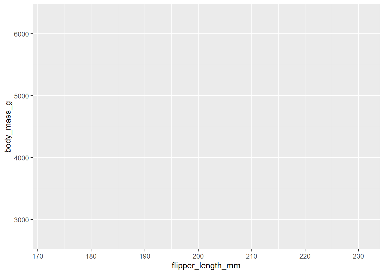
ggplot(
data = penguins,
mapping = aes(x = flipper_length_mm, y = body_mass_g)
)
# You will start seeing "data" on the plot once you set the "geometry".
# Here we set the "geometry" to be geom_point().
# Each "dot" on the plot represents a row of data from the tibble, i.e. one penguin.
ggplot(
  data = penguins,
  mapping = aes(x = flipper_length_mm, y = body_mass_g)
) +
  geom_point()
Warning: Removed 2 rows containing missing values (`geom_point()`).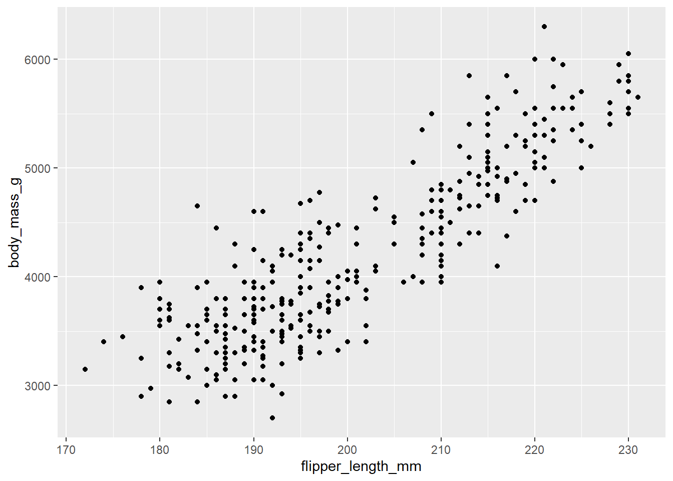
# We can add some color and shapes to each dot on the plot based on the species.
ggplot(
  data = penguins,
  mapping = aes(x = flipper_length_mm, y = body_mass_g, color = species, shape=species)
) +
  geom_point()
Warning: Removed 2 rows containing missing values (`geom_point()`).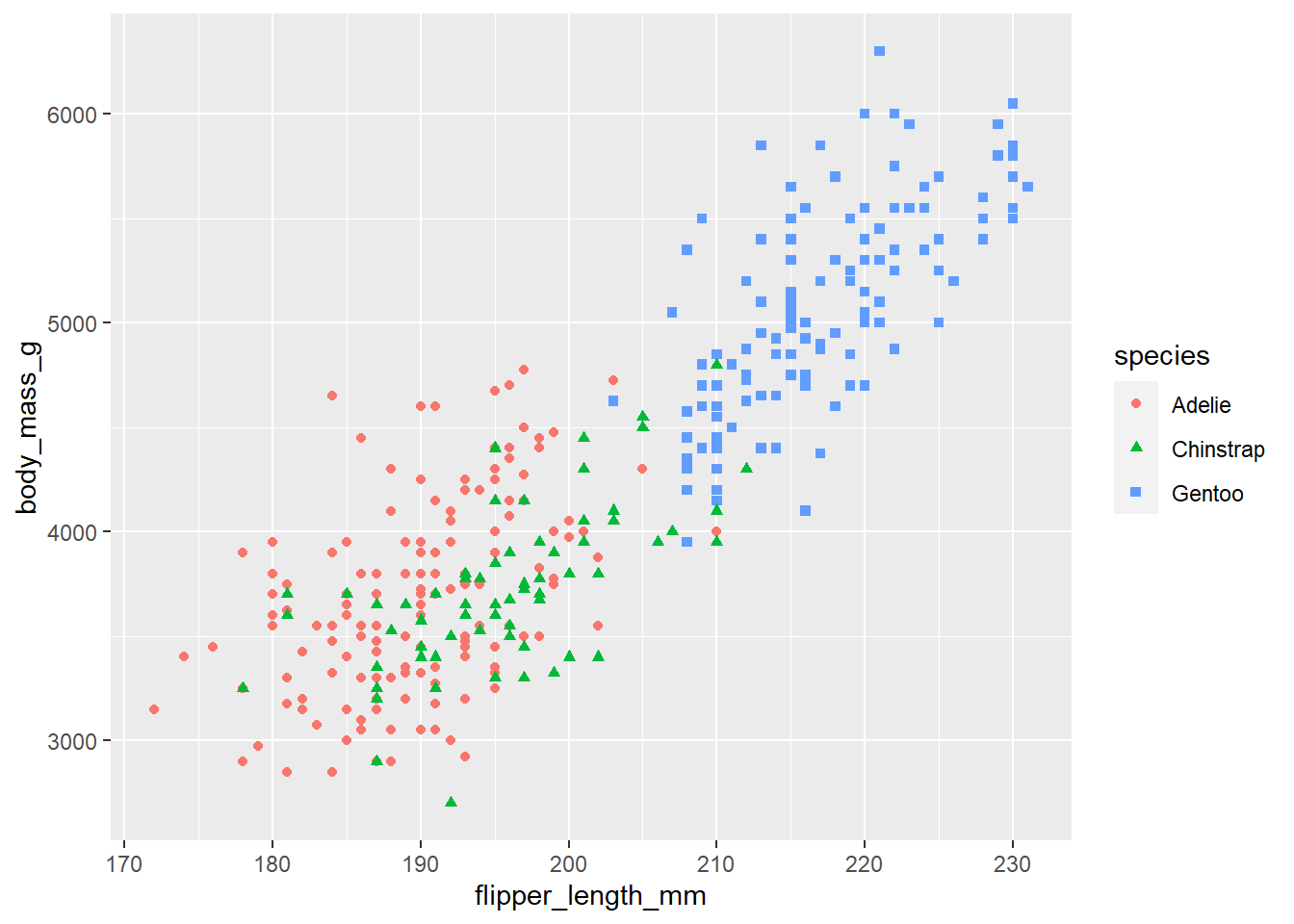
# The function call, geom_smooth(method = "lm")
# adds linear regressions lines, one for each species.
#
# Since "color=species, shape=species" was mapped in the ggplot function, the data was
# divided into 3 different subsets, one for each species.
# That is why there are 3 different linear regression lines, one for
# each species (compare this with the next plot).
ggplot(
  data = penguins,
  mapping = aes(x = flipper_length_mm, y = body_mass_g, color = species, shape=species)
) +
  geom_point() +
  geom_smooth(method = "lm")
`geom_smooth()` using formula = 'y ~ x'Warning: Removed 2 rows containing non-finite values (`stat_smooth()`).
Removed 2 rows containing missing values (`geom_point()`).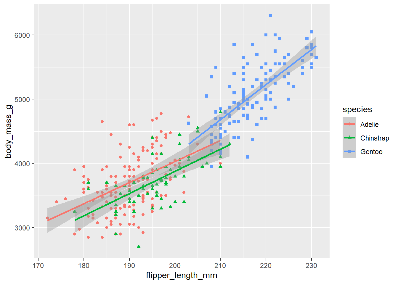
# In the following plot, "color=species, shape=species", was moved
# from the ggplot function to the geom_point function.
# Since we did not set the color in the ggplot function we no longer
# consider the data as three different subsets and we get a single linear
# regression line for the entire set of data.

ggplot(
  data = penguins,
  mapping = aes(x = flipper_length_mm, y = body_mass_g)
) +
  geom_point(mapping = aes(color = species, shape = species)) +
  geom_smooth(method = "lm")
`geom_smooth()` using formula = 'y ~ x'Warning: Removed 2 rows containing non-finite values (`stat_smooth()`).
Removed 2 rows containing missing values (`geom_point()`).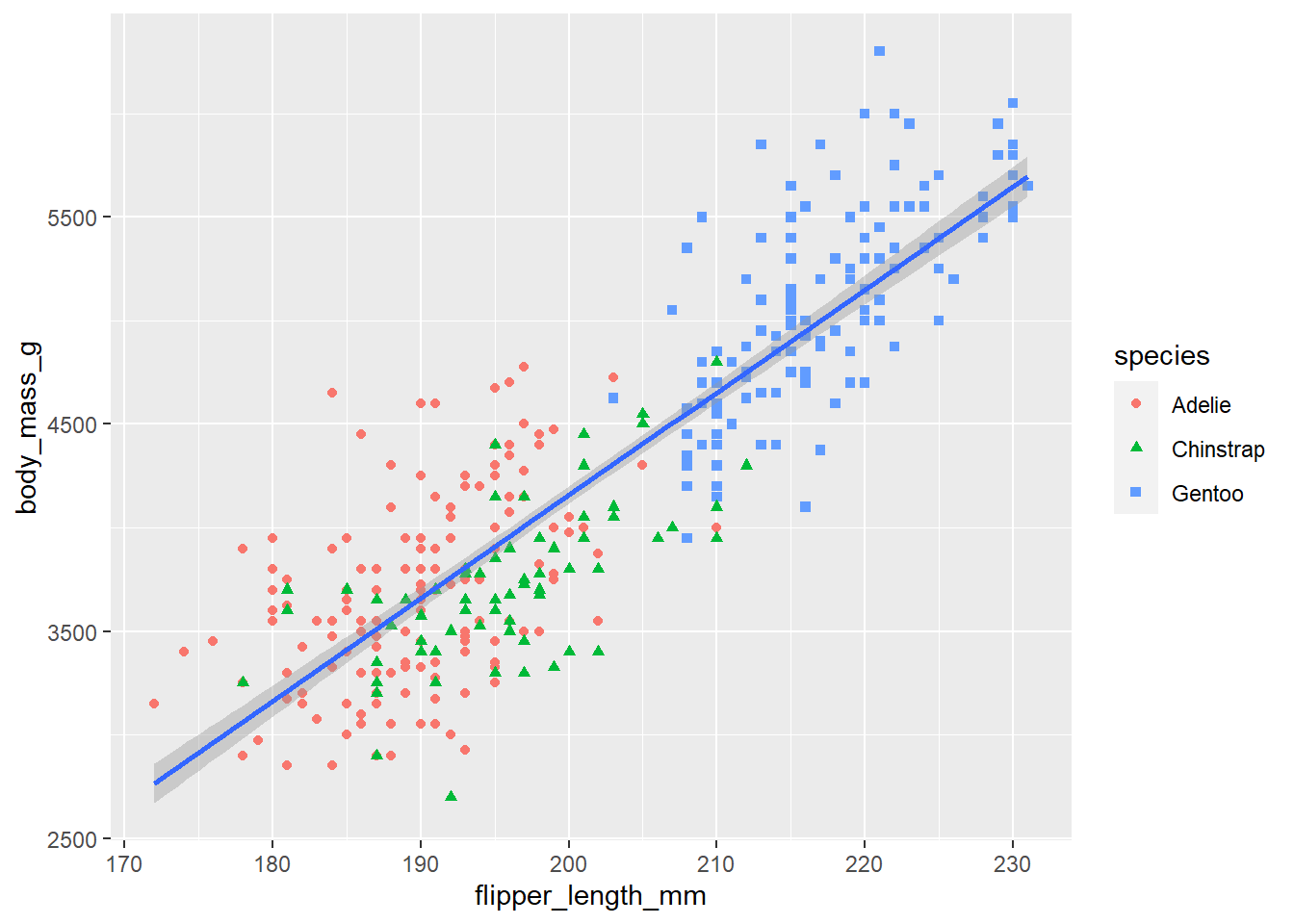
# Finally, the following plot adds a title and subtitle to the graph
# and labels for the x-axis, y-axis and legend.

ggplot(
  data = penguins,
  mapping = aes(x = flipper_length_mm, y = body_mass_g)
) +
  geom_point(aes(color = species, shape = species)) +
  geom_smooth(method = "lm") +
  labs(
    title = "Body mass and flipper length",
    subtitle = "Dimensions for Adelie, Chinstrap, and Gentoo Penguins",
    x = "Flipper length (mm)", y = "Body mass (g)",
    color = "Penguin Species", shape = "Penguin Species"
  )
`geom_smooth()` using formula = 'y ~ x'Warning: Removed 2 rows containing non-finite values (`stat_smooth()`).
Removed 2 rows containing missing values (`geom_point()`).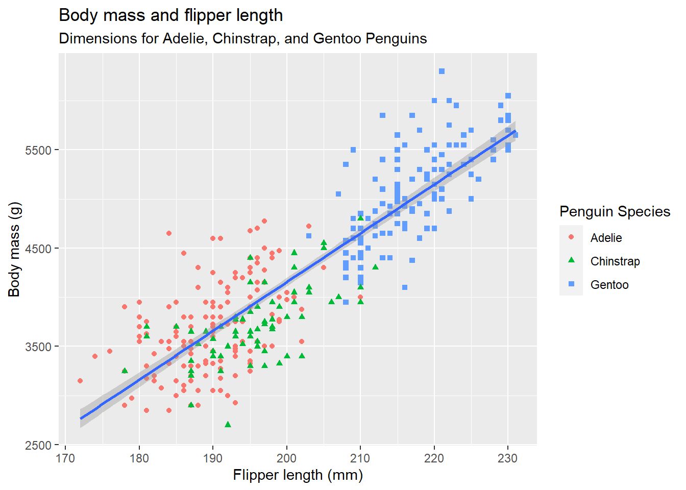
11.2 Other stuff
The info above goes through the main ideas of how to use ggplot2. Using that knowledge you should be in good shape for learning on your own how to use other more advanced features of ggplot2.
The rest of the webpage, https://r4ds.hadley.nz/data-visualize, shows how to use several other features of ggplot2. The following topics are described on the rest of that webpage:
Other geometries (histograms, box plots, etc)
How to use several other geometries (i.e. bar blots, histograms, density plots, box plots, stacked bar plots).
Facets
How to break up a graph into several smaller graphs using the facet_wrap function.
How to save a plot to an image file
You can use the ggsave function to save an image file with a copy of the last plot that you created. You can then import the image file to other files, e.g. a Word document, a powerpoint, etc.
See ?ggsave for more info.